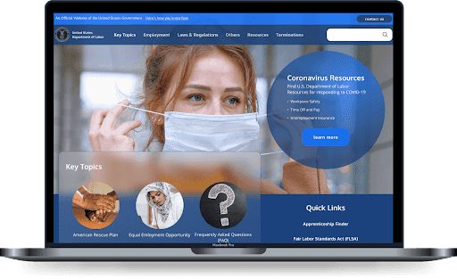
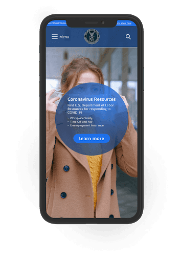
Department of Labor
Department of Labor website redesign
Overview
Background
The DOL's mission is to foster, promote, and develop the welfare of the wage earners, job seekers, and retirees of the United States; improve working conditions; advance opportunities for profitable employment; and assure work-related benefits and rights.
Objectives
To analyze the Department of Labor’s website through the use of research and methodologies and provide recommendations to improve its UX.
My Role
UX Designer
Timeline
Two weeks
Tools
Figma, Miro, Zoom, Otter.ai, inVision
Research
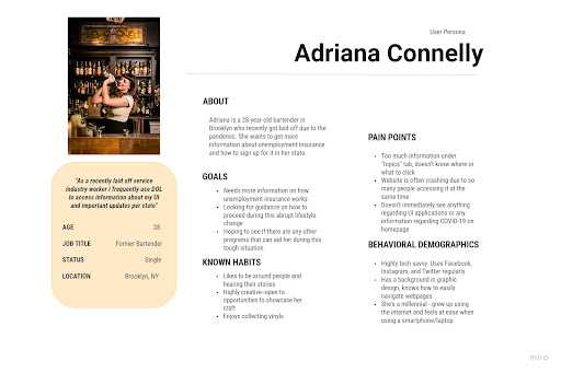
User Persona
I created a user persona based on the assumptions of who uses the government website.
Usability Tests
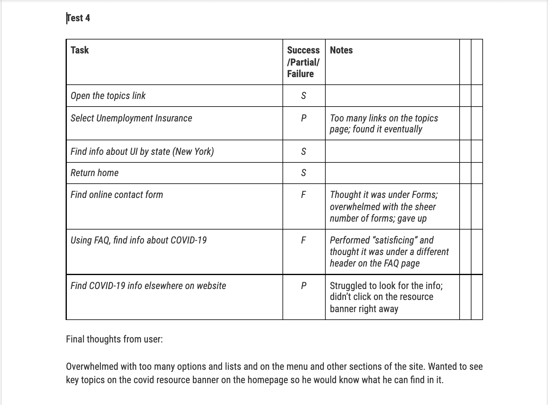
Then, I conducted usability tests on the current website to identify key pain points users face when looking for unemployment insurance and getting more information. We asked 5 people to perform three tasks:
- Find the unemployment insurance page
- Find information related to the Coronavirus in the FAQ page
- Find the DOL online contact form
Target Users: Anyone between the ages of 18 - 62.
Note: We knew beforehand that users would fail to find any coronavirus related information on the FAQ page. We wanted to get feedback from the users' experience and find out where else they would find this information on the website.
Usability Tests Findings
30%
Only 30% found the online contact form
Other notable user feedback were the ff:
- There were too many links in the menu, making it near impossible to navigate
- Search in FAQ page didn't pull up any relevant results
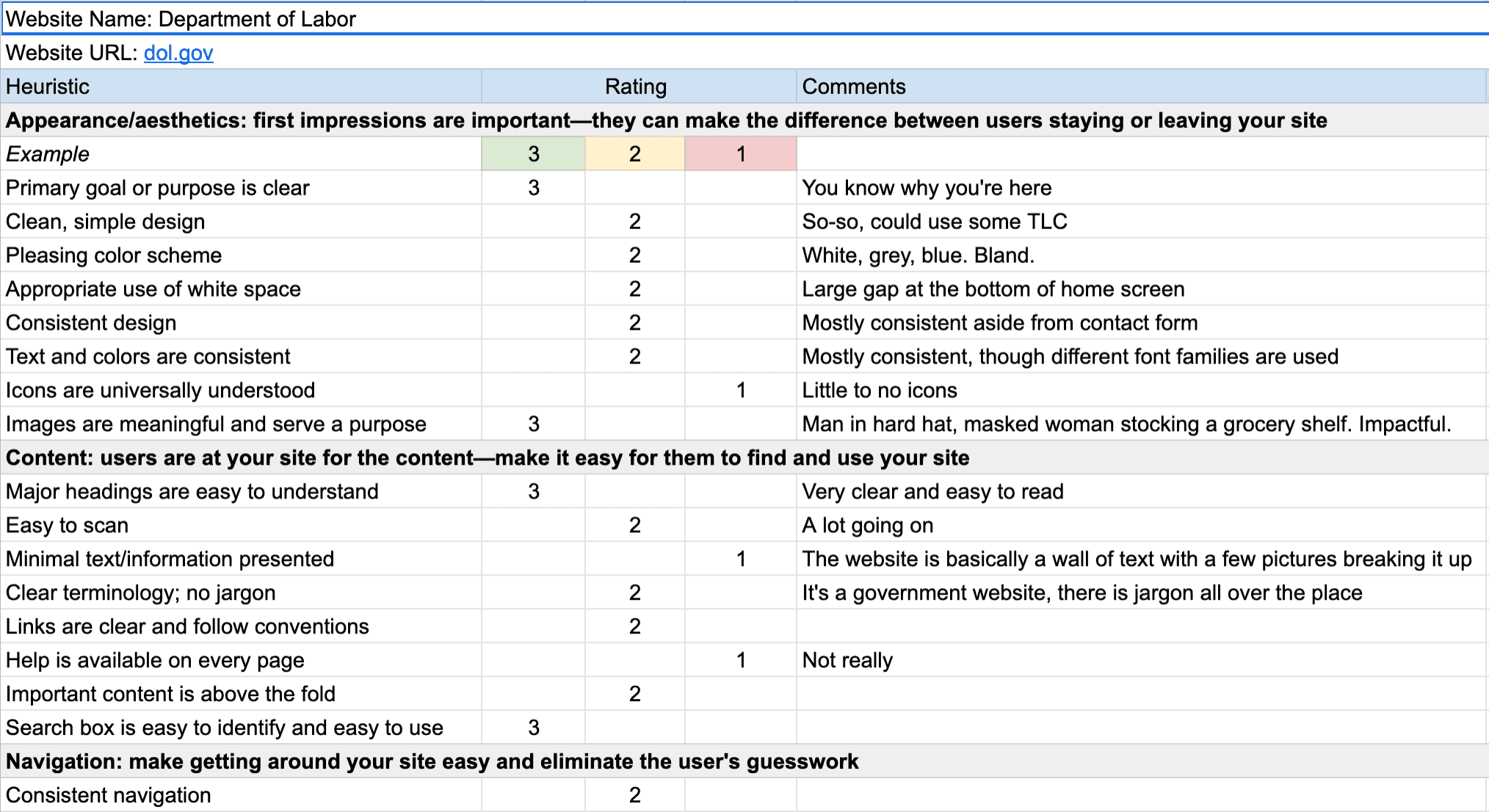
Heuristic Evaluation
The Department of Labor's website did an adequate job with its design. The images used were appropriate and the goal of the website is clear. However, there are just too many links presented in any given page. The information can also be presented in a better way.
Annotations
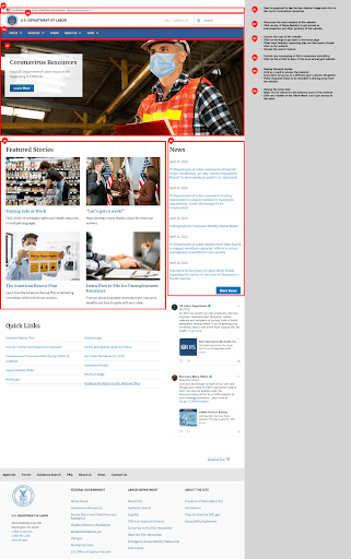
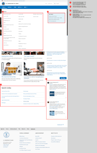
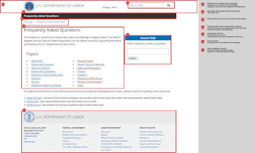
I annotated the pages I wanted to redesign to identify opportunities and improve upon upon the user journey for key tasks we identified. There were a lot of glaring issues between pages. Some of which are the ff:
- Global navigation isn't consitent across pages
- Topics submenu contain too much information
- Contact Us page seem like an entirely different website; colors and even the logo are different from the home page
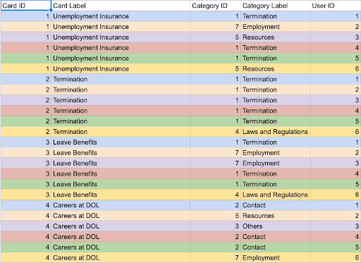
Card Sorting
I conducted a hybrid card sort with six participants to give us an idea of how to chunk the vast amount of topic links of the website.
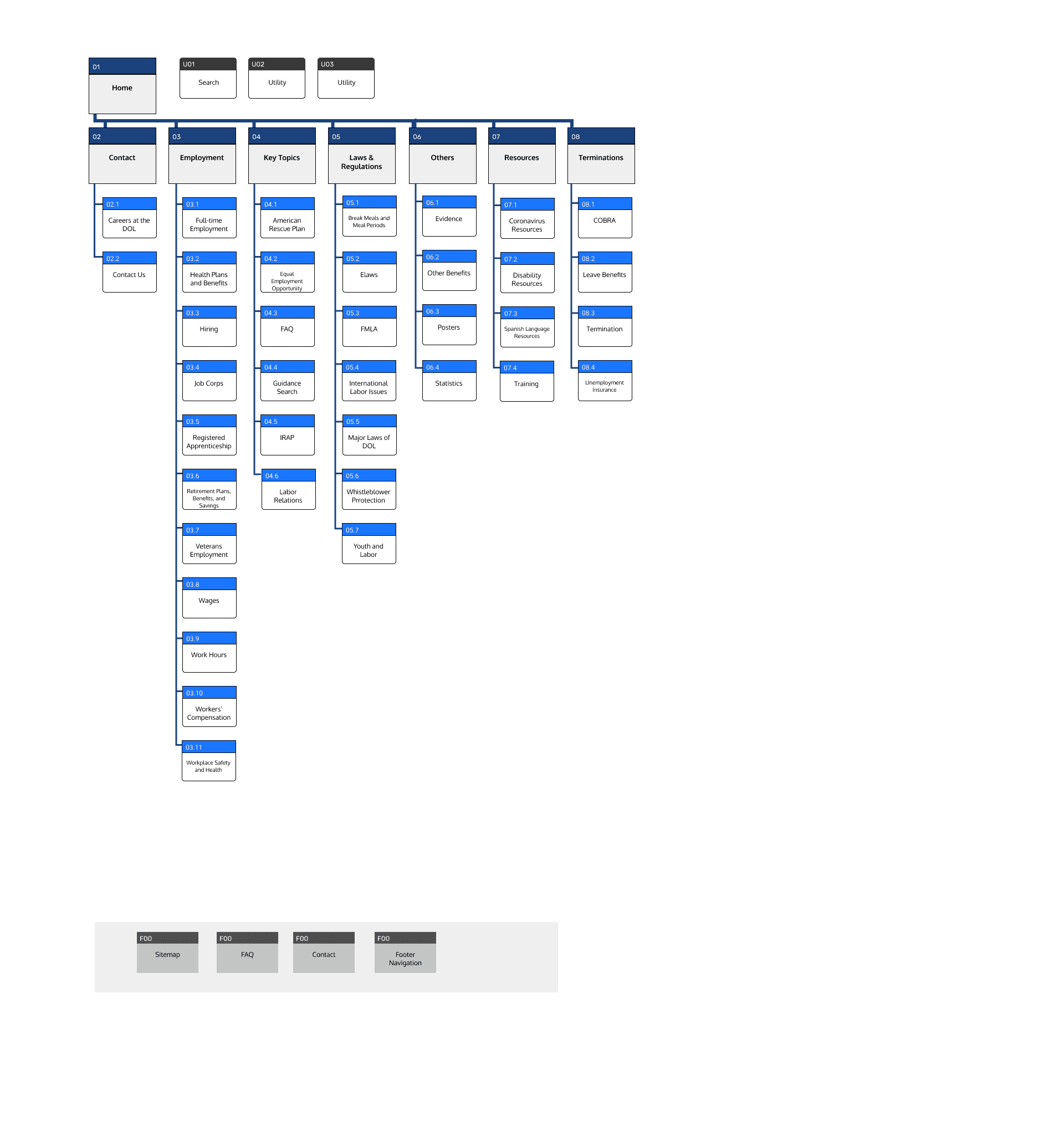
Site Map
After evaluating the card sorting results, I was able to visualize the site structure and come up with a site map
Prototyping & Testing
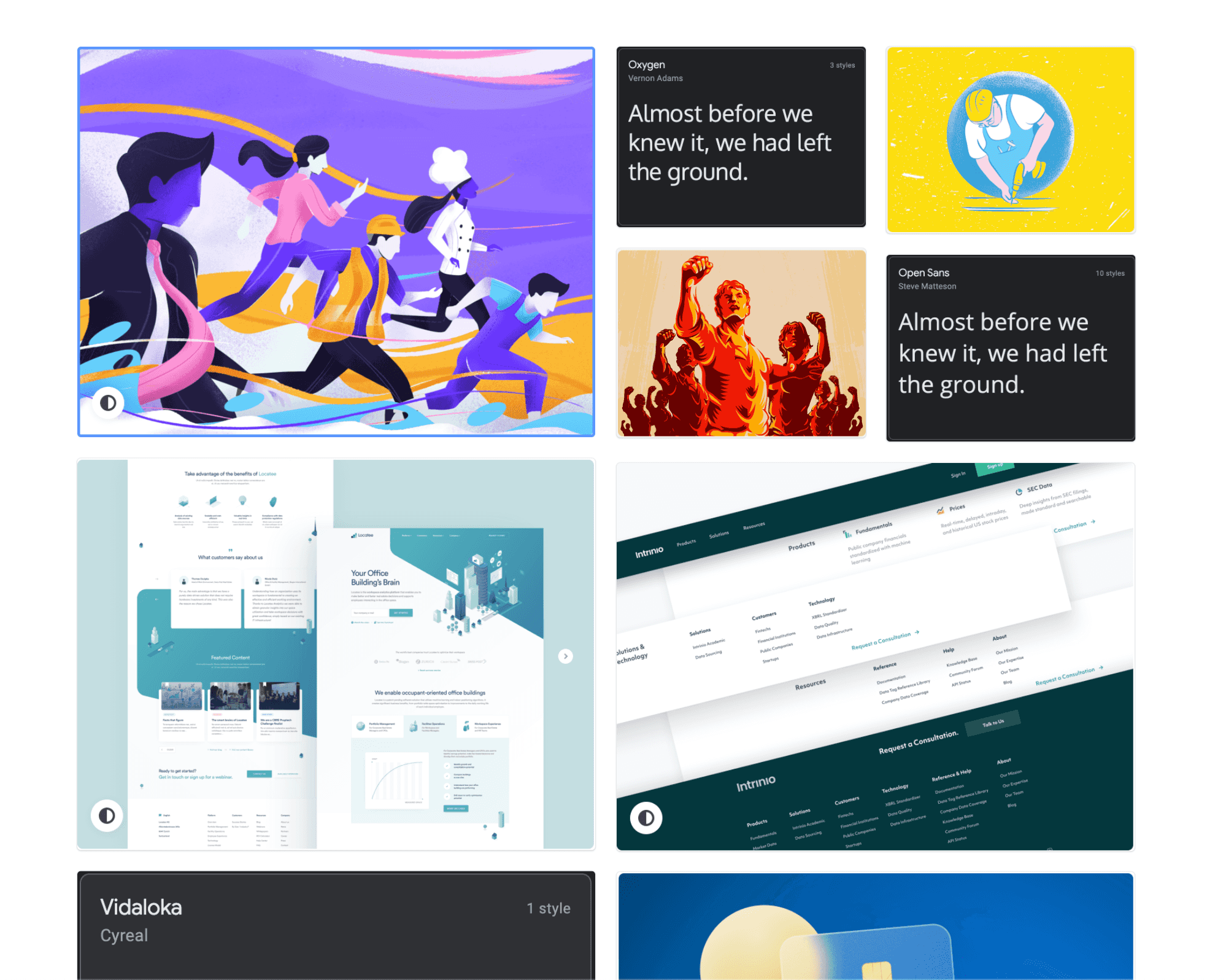
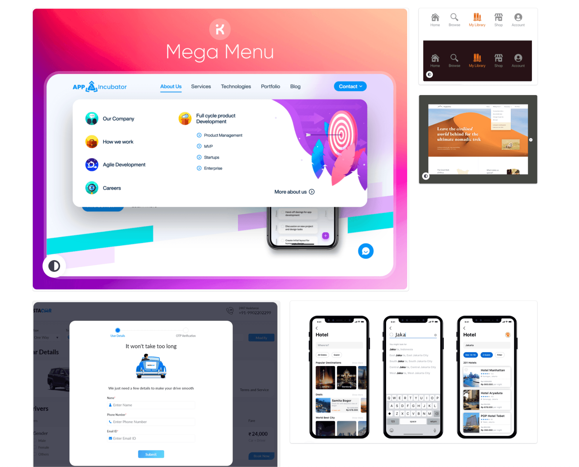
Mood Board
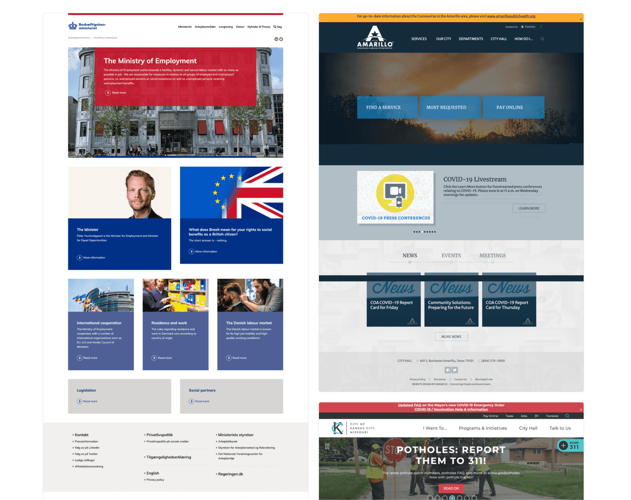
I drew inspiration from various government agencies that demonstrated a clean and professional aesthetic. I was immediately drawn to sans-serif fonts, monochrome palettes, and flowing elements to reinforce an easy-to-use atmosphere. The website needs to achieve a balance between authority and approachability. Users should feel they are in good hands when they visit the website and believe they would find the information they are looking for.
Style Guide
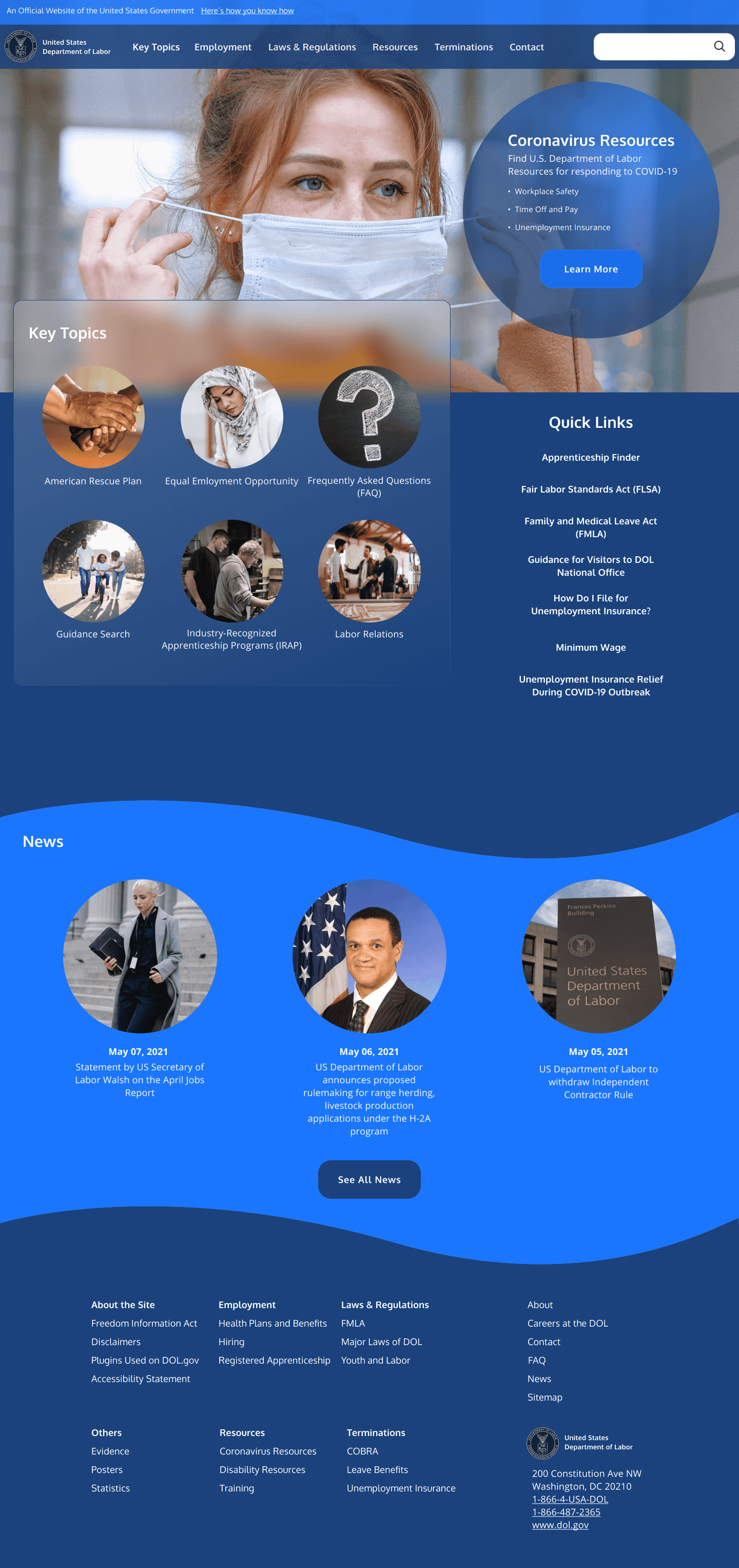
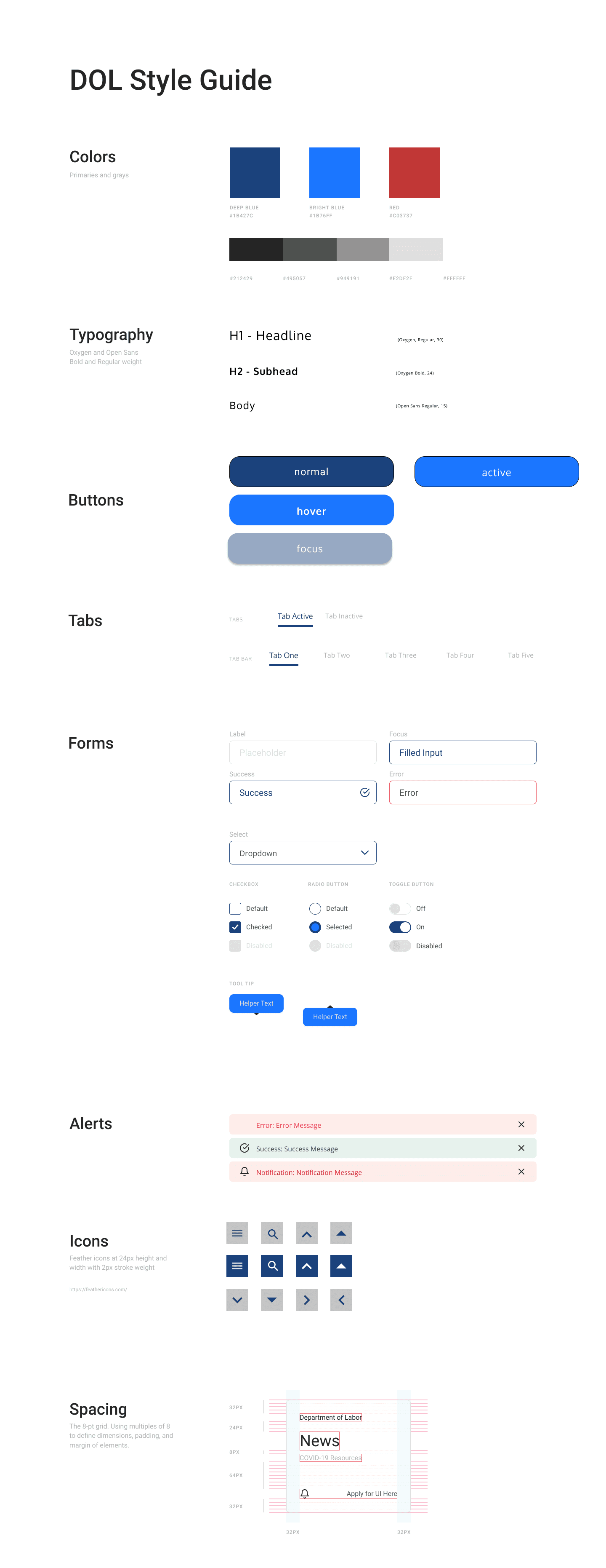
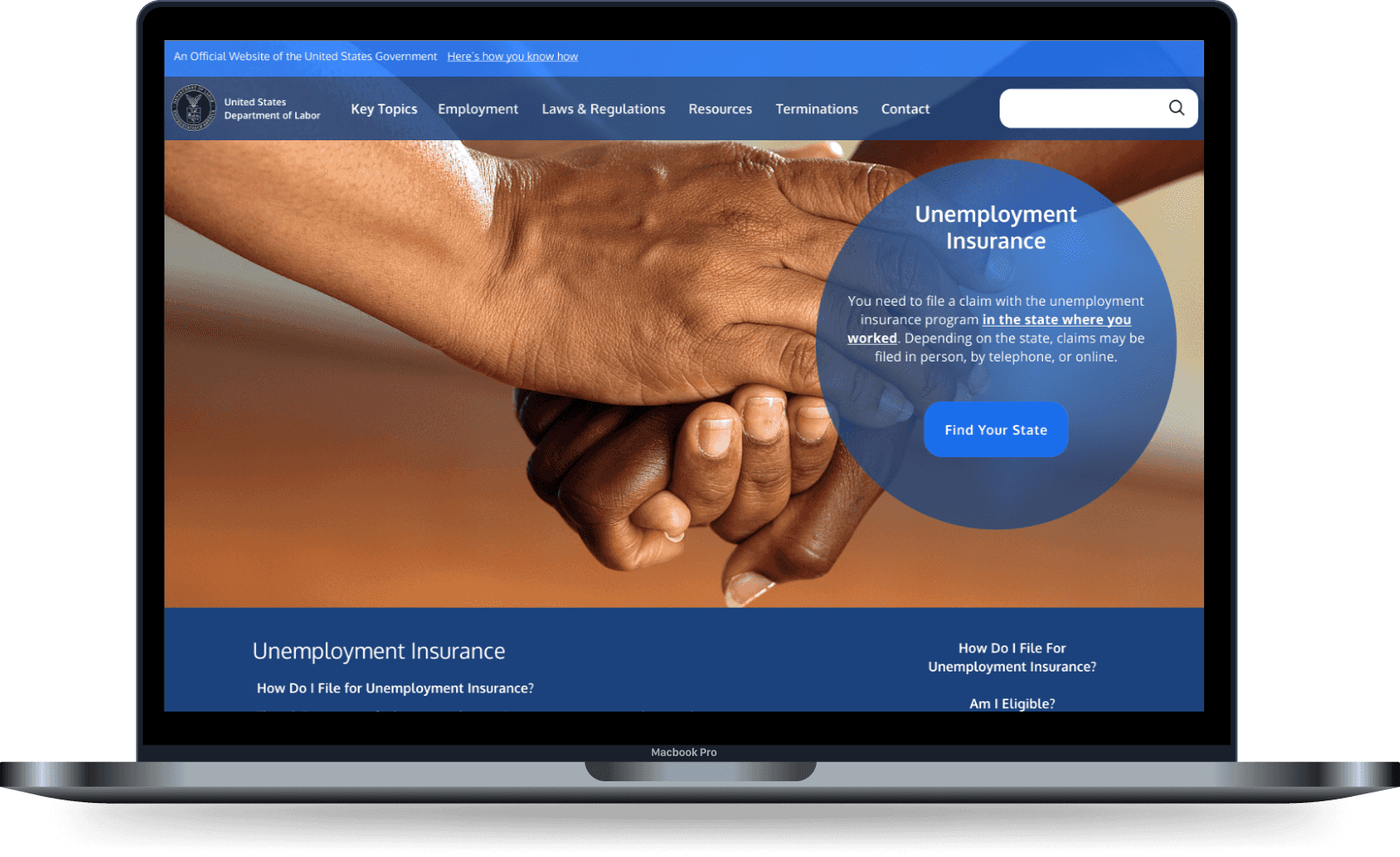
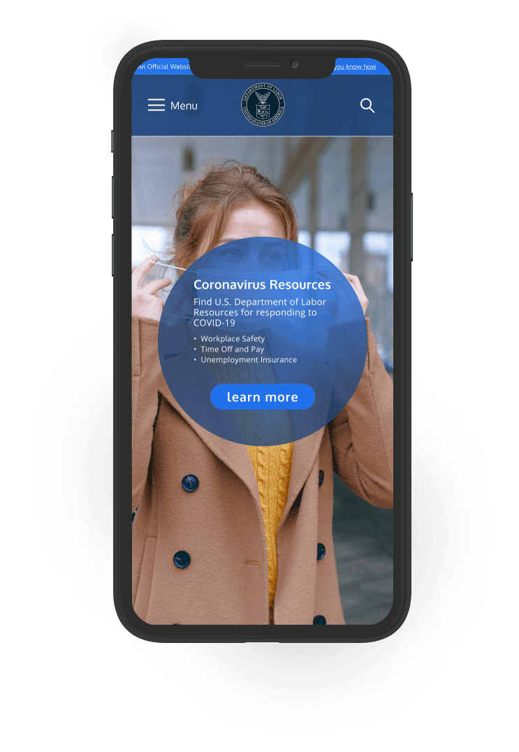
I used a monochrome blue palette with red for error messaging. Header and body font families use Oxygen and Open Sans respectively to maximize legibility and to minimize harsh edges. Buttons are fully rounded and section breaks are curved and flowing.
Wireflows
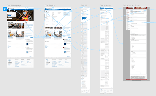
I made wireflows for the three tasks I focused on to map out the user journey.
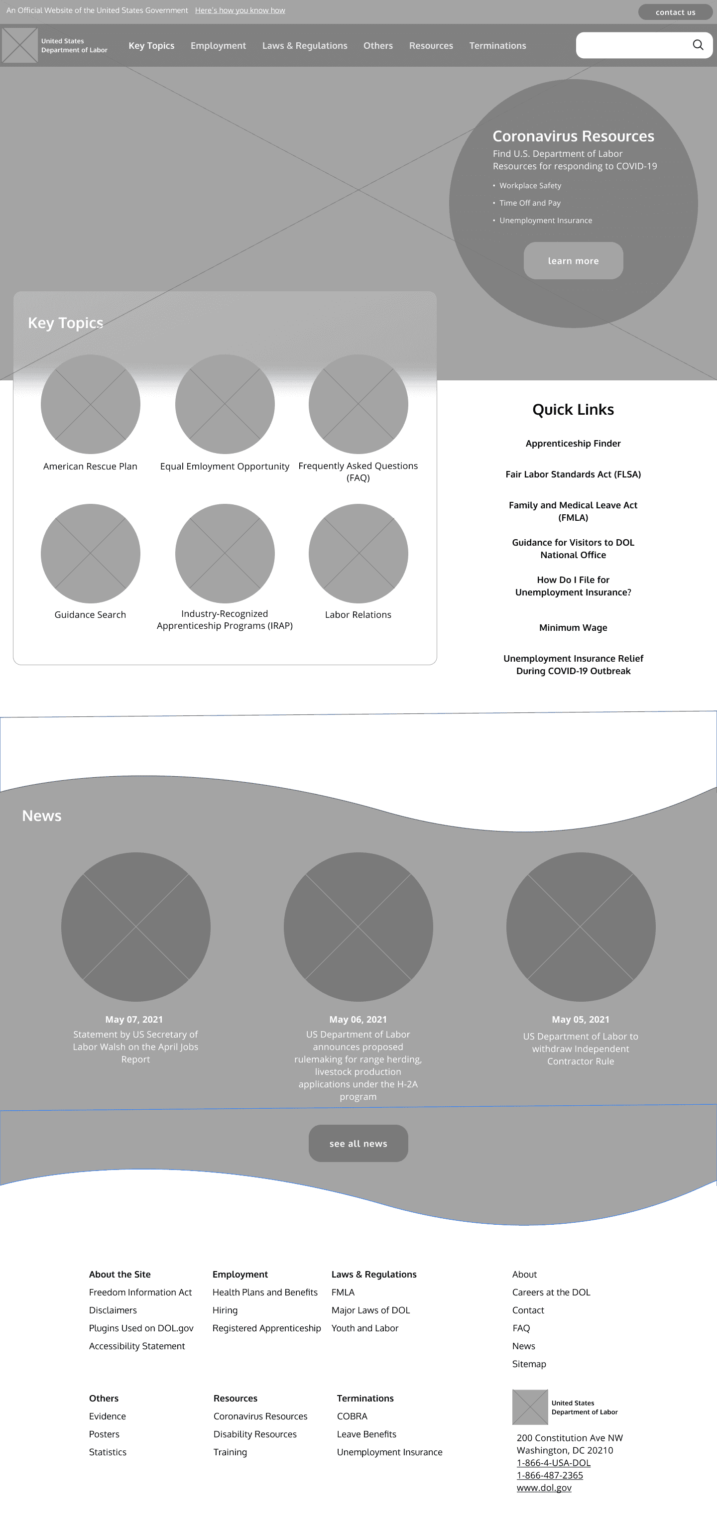
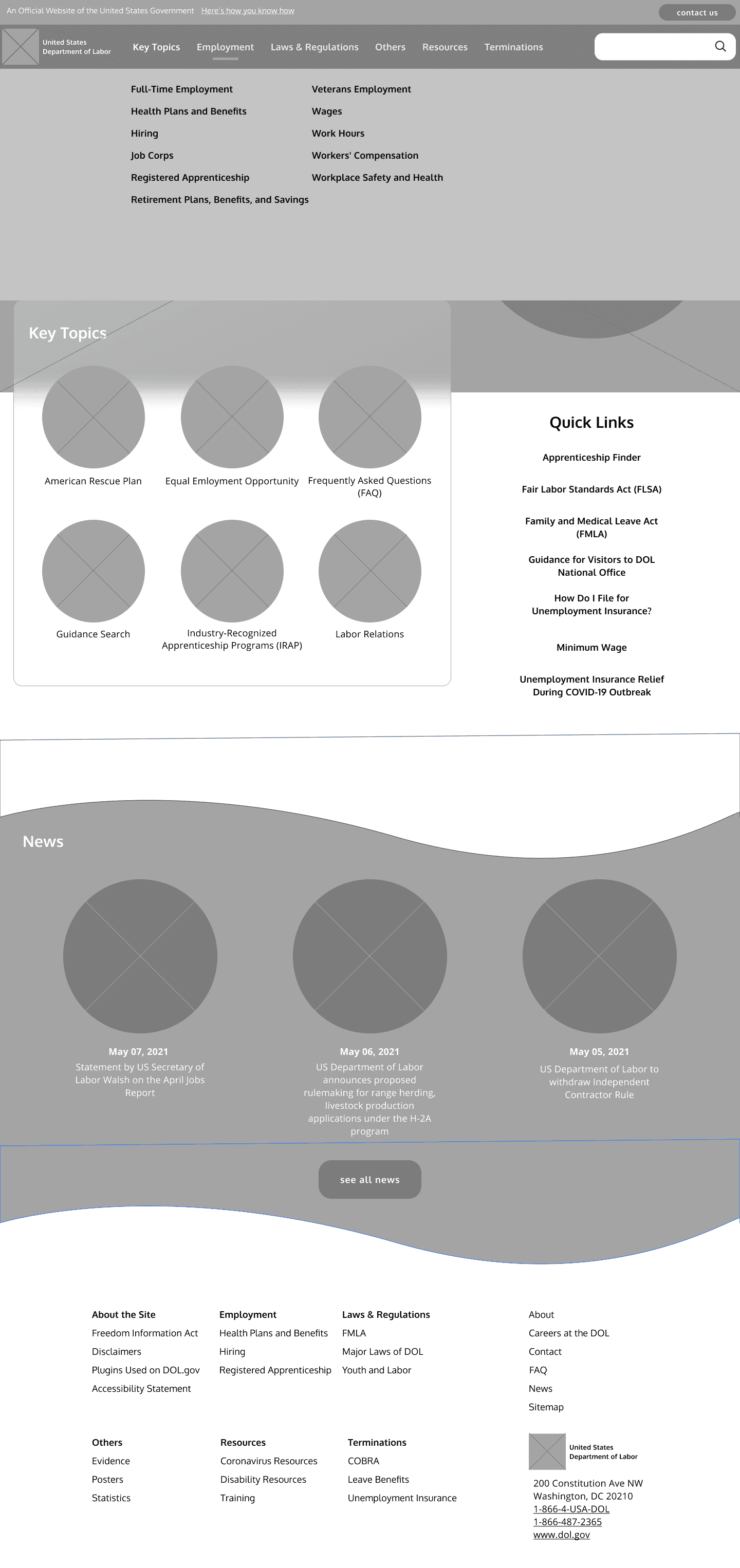
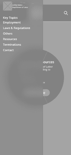
Lo-Fi Prototypes
Lo-Fi User Tests
I conducted 3 user tests on my lo-fi prototypes to test the redesign and identify areas of improvement. Some of the feedback I received are the ff:
- "Contact Us" button was almost always missed
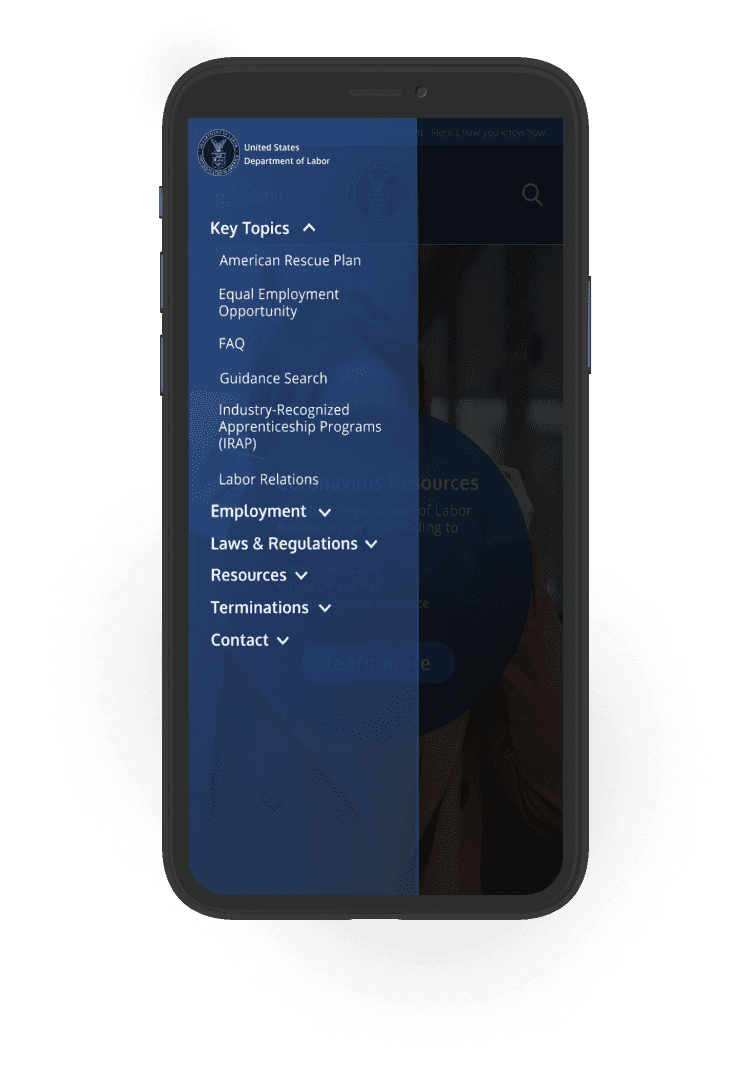
- Vertical and horizontal alignment on the mobile menu and desktop footer needs work
- Desktop version needs some visual indication that the primarhy link is in a hover state
Hi-Fi User Tests
I did a second round of user testing for my hi-fi prototypes. I took out the “Others” primary link as it caused confusion for some users and added it inside "Resources" instead. Although users didn't have any trouble finding the contact link, there were other areas that still had room for improvement:
- Increase spacing between primary nav links on the mobile menu
- CTA buttons, search box, and mobile footer font size can be smaller
- Padding between sections in the unemployment insurance page can be increased and be more consistent
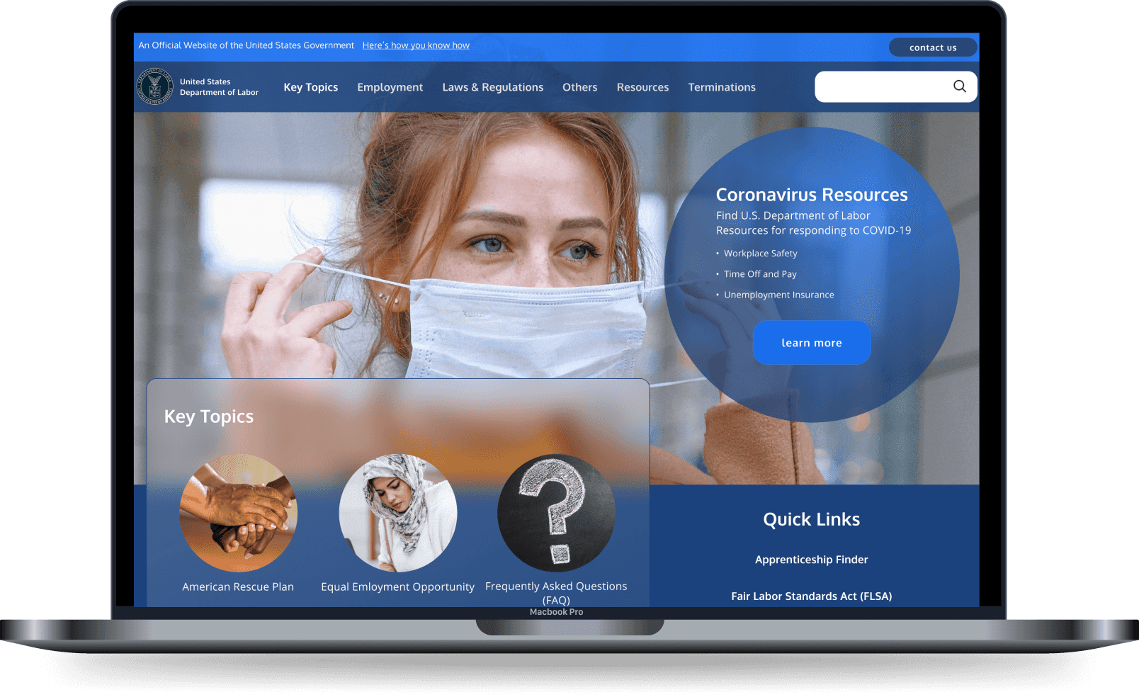
Hi-Fi Mockups
Next Steps
The contemporary design on the two pages is a great start in transforming the Department of Labor's website into something more professional and trustworthy. Users can now easily find the contact page and the information architecture on the navigation is more palatable. However, given the enormous amount of services the Department of Labor has to accommodate on their website, there would always be something else to work on:
- Redesign the FAQ and Contact page
- Figure out how to improve the Forms page and seamlessly incorporate it to the design
- Improve desktop footer layout
