


MoreArt
Redesigning MoreArt, an organization that supports collaboration between artists and communities to create public art
Overview
Background
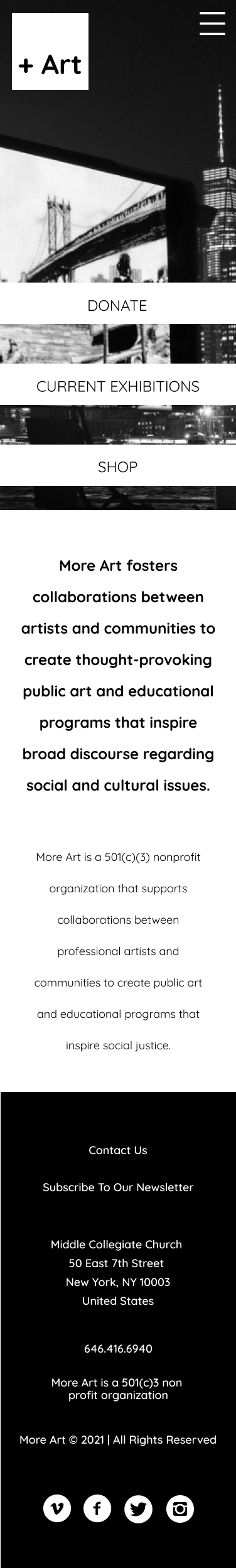
More Art is a 501(c)(3) nonprofit organization that supports collaborations between professional artists and communities to create public art and educational programs that inspire social justice.
Objectives
To redesign MoreArt.org's website by applying the design thinking process
My Role
UX Designer, team of 3
Timeline
Two weeks
Tools
Figma, Miro, Zoom, Otter.ai, Previewed
Research
Research Interviews
We began the process by conducting 4 research interviews to figure out the habits and painpoints of users when they donate online. Moreover, we wanted to know the general needs of people who are interested in social initiatives, and get a sense of how they perceive non-profit organizations as a whole.


Research Findings
- There is a desire to see people genuinely help others
- There is a general agreement that it's important to support social causes
- They discover non-profit organizations and social causes via social media
“In an age where everything is driven by profit, non-profit organizations believe in a cause and I want to help”
Survey
86.4%
We also conducted a survey to get some quantitative data regarding this subject. Out of 22 responses, 86.4% wanted to know where their donations went.
What makes it difficult to donate?
"Not knowing where the donation will end up"
"It's not convenient"
"Lack of trust"
Proto Persona
We created a proto persona to represent our assumptions of MoreArt's ideal user


Heuristic Evaluation
After performing a heuristic evaluation on MoreArt's current website, it was evident that there was a need to make the designs between pages feel more consistent. There were also a number of broken links throughout the site. Despite all this, the website does have help available in every page and there are a limited number of buttons and links.


Annotations
We annotated MoreArt's website as well to identify notable elements and key areas of improvement


Definition & Ideation
Affinity Diagram
We gathered all our findings from the research interviews and organized them into an affinity diagram. Concerns about transparency and trust naturally came up as we grouped the data.


User Insight
We decided to focus on the themes surrounding transparecy and trust as this seemed to be the most important factor for our users.
People who donate online need to have a simple, reassuring, and accountable giving experience because trust and transparency are key into motivating users to donate.
User Persona


Competitor Analysis
We conducted a competitor analysis to evaluate the strengths and weaknesses of organizations within the same space.


- Donate page is easy to scan
- Website is beautifully designed
- No breakdown of how the money is being used

- There is a page dedicated to the financial breakdown of donations
- Lots of donation options
- Aesthetics need improvement


- Prominent donation button
- Allows one-time as well as monthly donations
- Homepage is a little busy
Prototyping & Testing
I Like, I Wish, What If...
We knew that we wanted the donation workflow to be simpler with a clean and modern design. Users should also be able to donate to specific projects.


Mood Board
Quicksand, a sans serif font, was used as it conveyed approachability. We also looked at museums and architecture that had a modern and contemporary feel to develop the website's aesthetics.


Style Guide
We used the striking Persian Blue that goes very well with the black background. Colors weere kept to a minimum to enhance the site's simplicity.


User Flows
We focused on the three main user flows of the website: donations, exhibitions, and the shopping experience


Lo-fi Prototypes


Hi-fi Prototypes


User Tests
We conducted 3 user tests on our hi-fi prototype to validate (or invalidate) our designs. We ask our users to RSVP on a project, make a $25 donation, add an item to their cart, and check out. Some of the feedback we received are the ff:
- RSVP cta was confusing
- Waited for a pop up to ask the user to check out; clicking the cart wasn't intuitive
- Kept seeing the value proposition on the donations page and thought something was broken
- Struggled to return home from the donations page; navbar missing on the page
- Checkout experience was intuitive


Next Steps
There were a lot of low-hanging fruits that our team addressed to vastly improve the overall experience on the website. Exhibitions are now more navigable better highlights MoreArt's previous and current endeavors. Checkout is more contemporary and intuitive. Lastly, the home page has clear value propositions, with the donation page more streamlined and reassuring.
Despite all these improvements, there is still more work left to be done.
- Redesign the artist's page.
- Include more ways to reassure customers during the giving experience (certifications, awards, display no. of donations).
- Follow-up with testers to see if the iterations worked.